I have been Very Busy of late. Partly this has been due to a mag deadline, which are always something of a cram job. Partly this has been due to editing work, which continues to keep my filthy hands from falling idle. Partly I’ve been (painlessly, as it turns out; which was nice given that my editing services page is by far the most critical element piece of web real estate I’ve ever had) switching seancregan.com over to Amazon S3 hosting for convenience and cheapness. And partly it’s been because I’ve been rejiggering cover designs to finally sort out my typography.
At the start of this month I alluded to having to decide what to do with my increasingly decrepit shelf of existing work. I was thinking of setting it all free, switching over to a tipjar, and forgetting about it. This is what I’ve done (although setting things free on Amazon means tediously spamming the “report a lower price” link for each until SUCCESS). But since I was going to do final updates to each - stripping out afterwords, finalising the ‘also by’ page, and including a big note at the front saying “you shouldn’t pay money for this” - it gave me the chance to sort out cover typography.
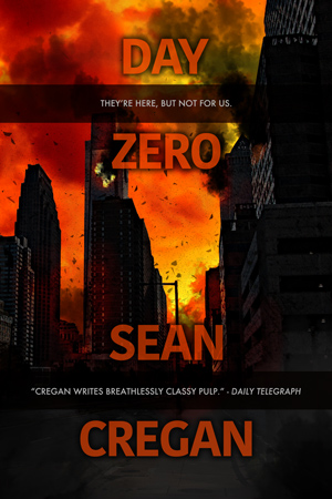
Now, I quite enjoy jacket design, and (I like to think) I’m reasonably proficient at it on the graphics side. But I’ve always struggled to get my text right. The old versions were OK, passable, but not quite slick enough. There’s also the question of “branding”. At Polis, Jason was going to release everything under one name, regardless of what they’d been under before, to make for a consistent identity. Which is a fine idea, but in the UK I’ve had two and I’m not sure which has more pull (for a given value of “pull” roughly equal to the strength of a soft fart on a warm summer’s day). “John Rickards” was probably more commercially successful, but “Sean Cregan” was better and more recent (and for some reason is a lot easier to get correct results for in the shitty search engine used by iTunes). An alternative to using a single name is to adopt a single look, a shared design used across both. Which, after much monkeying around, is what I’ve got.
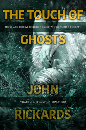
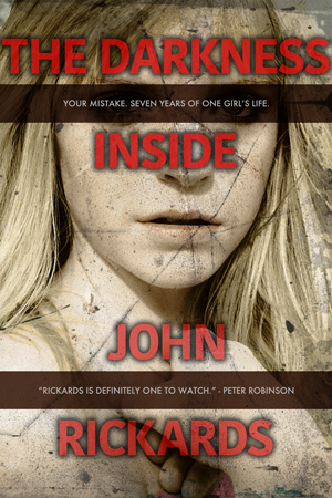

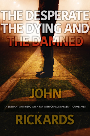
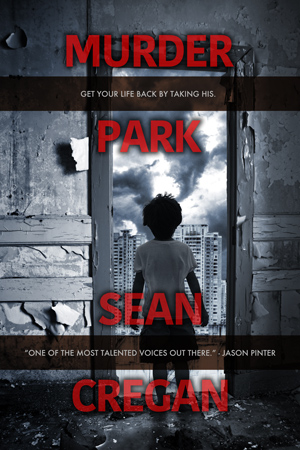

The only time I had to break format slightly was with DDD, but thankfully with three equal lines in the title it just meant missing off the tagline. TDI came close - “the darkness” turns out to use a lot of wide characters - but thankfully once properly kerned, the top line just about fit.
I’m happy with the design, and it’ll be easy to use in future. One thing I’ll certainly think about now that I’ve never really considered before is whether or not a putative title for a book will actually work on a cover without totally changing the look you use. AYLB was always a nuisance in the past, but works OK here. DDD has a nice rhythm to it and it should be easy to balance each line with the next, as I had before, but it became a real pain. I’ve noticed I’m starting to sit on a reasonable pile of finished or near-finished work of one sort or another, so I suspect I’m going to have to bear that in mind before too long.
Anyway, as you were.